
Last Updated: October 23, 2026
Quick Summary
To coordinate room decor, start with your personal style, assess your space and budget, then build a color scheme using the 60-30-10 rule: 60% dominant neutral color, 30% secondary color, and 10% accent color. Arrange furniture for visual balance, layer patterns and textures strategically, and repeat design elements throughout to create cohesion.
- Save 20-30 design images to identify your personal style patterns before purchasing anything.
- Use the 60-30-10 color rule: 60% neutral base, 30% secondary color, 10% accent color.
- Layer your lighting with overhead, task, and accent lighting to shape mood and color perception.
- Vary pattern scales and repeat your color scheme across patterns to prevent visual chaos.
- Repeat your accent colors and materials in at least three places throughout the room for cohesion.
Table of Contents
- How to Coordinate Room Decor: Start With Your Foundation
- How to Choose a Room Color Scheme That Works
- How to Arrange Furniture in a Room for Visual Balance
- How to Mix Patterns in Home Decor Without Clashing
- Room Decorating Rules: Focal Points, Lighting, and Cohesion
- Practical Room-by-Room Coordination: Where to Start
- Common Coordination Mistakes to Avoid
- Frequently Asked Questions
How to Coordinate Room Decor: Start With Your Foundation
Coordinating room decor looks effortless when done right, but most people approach it backwards: they buy pieces they like individually, then wonder why nothing feels cohesive. How to coordinate room decor starts before you purchase anything, with understanding yourself, your space, and your budget.
At Apply Your Vibe, we believe in one principle: foundation first, accents second.
Define Your Personal Style
Your personal style is the throughline connecting every piece in your room, knowing what resonates with you and why, not following trends blindly.
Spend 15 minutes saving images that make you stop on Pinterest, Instagram, or design sites. After gathering 20-30, look for patterns: minimalist or layered? Warm tones or cool?
Assess Your Space and Budget
Before buying anything, walk through your room with a critical eye. How much natural light does it get? What's its size and shape?
Lighting matters more than most people realize: a color that looks warm in a bright room can feel flat in a dim one. Pieces like the Sunset Projector Lamp or the Energy Saving LED Bamboo Bedside Lamp shift how you perceive color and mood.


Be honest about your budget. Coordinating room decor doesn't require spending a lot, but it requires spending strategically. Identify your anchor pieces (bed, desk, sofa, major furniture), which usually aren't worth replacing.
How to Choose a Room Color Scheme That Works
Your color scheme is the backbone of coordinated room decor. Get this right, and everything else falls into place.
Use Color Theory and Complementary Colors
Color theory is simple: certain colors work together because of how they sit on the color wheel.
For most rooms, especially smaller spaces, analogous schemes work better because they feel cohesive and restful.
Recent design research suggests that warm minimalism and clear layouts are shaping 2026 interior trends, which means neutral bases with warm accent tones are having a moment.
Apply the 60-30-10 Rule
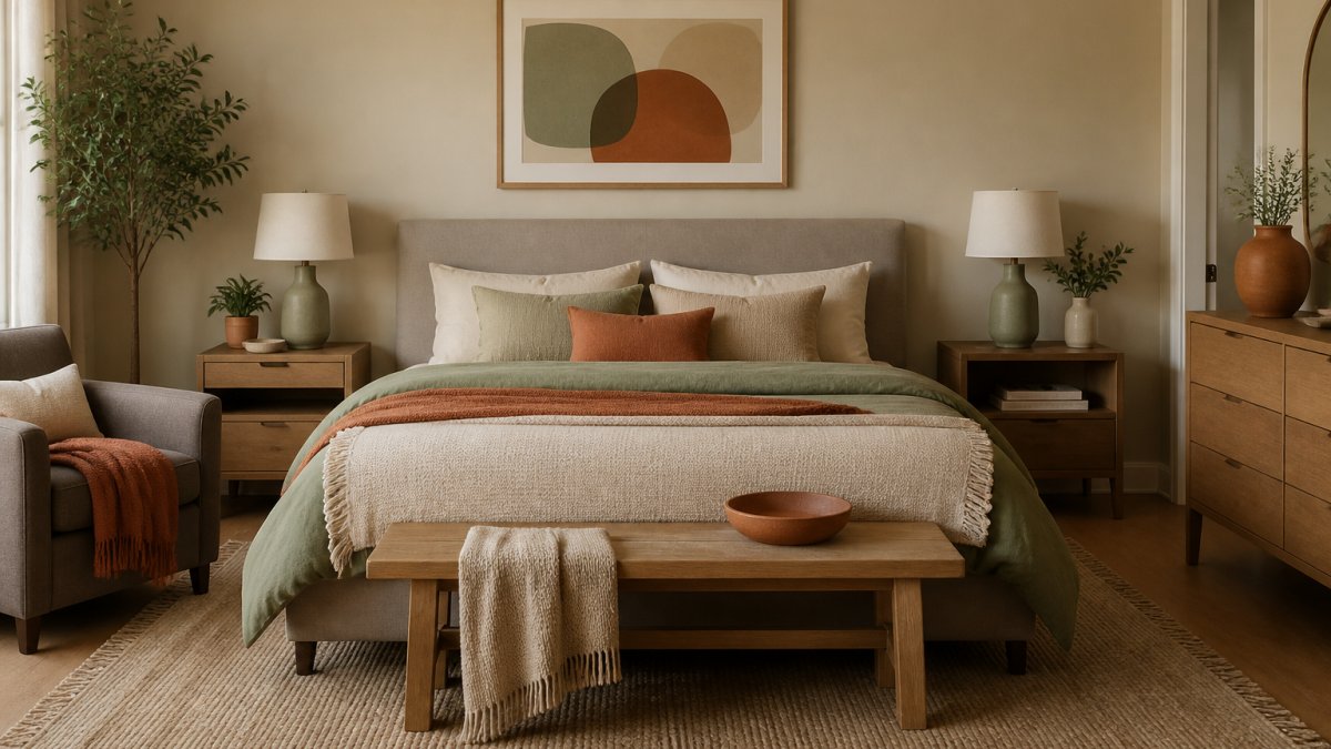
The 60-30-10 rule is the simplest framework for coordinating room decor: 60% dominant color (usually a neutral), 30% secondary color, 10% accent color that pops.
This ratio gives your eye a place to rest while creating visual interest.
The rule is flexible: a bedroom might use soft gray (60%), warm beige (30%), and sage green (10%); a dorm might use white (60%), soft blue (30%), and coral (10%).
Select Your Neutral Base and Accent Hues
Your neutral base is the foundation of how to coordinate room decor: the color that appears most frequently and sets the overall mood.
Once you've chosen your neutral, pick accent hues that complement it and reflect your style.
The mistake most people make is choosing too many accent colors. Stick to one or two, and repeat them throughout your room in wall art, textiles, and accessories to create cohesion.
How to Arrange Furniture in a Room for Visual Balance
Furniture placement affects how color and decor read in your space. A poorly arranged room feels chaotic no matter how perfect your color scheme is.
Understand Scale, Proportion, and Layout
Scale matches furniture size to room size: a large sectional overwhelms a tiny dorm room, and a small chair gets lost in a spacious living room.
Proportion applies to decor too: small art in a large room looks lonely, and large art in a small room feels aggressive.
Layout determines flow. Arrange furniture to create a natural pathway, and avoid pushing everything to the walls, which makes rooms feel disconnected.
Create Symmetry or Asymmetry Intentionally
Symmetry feels formal and calm; asymmetry feels dynamic and modern. Both work if you choose intentionally and commit.
Asymmetrical arrangements balance visual weight without mirroring, like a sofa on one side balanced by a chair and bookshelf on the other.
The mistake is mixing both without intention. If you choose symmetry, commit; if you choose asymmetry, make sure the visual weight actually balances.
How to Mix Patterns in Home Decor Without Clashing
Patterns add personality and depth to coordinated room decor. They're also where most people panic. The solution isn't to avoid patterns, it's to mix them strategically.
Match Pattern Scale and Repeat Colors
The most important rule: vary your pattern scales.
Second, repeat your color scheme across patterns. If your accent color is sage green, choose patterns that include sage green.
Start with one statement pattern, maybe a patterned rug or curtains. Then add supporting patterns in smaller doses: throw pillows, artwork, or small textiles.
Layer Textures and Materials
Texture is the often-overlooked element of coordinated room decor. A room with only smooth surfaces feels flat.
Combine smooth materials (glass, metal, polished wood) with textured ones (linen, wool, raw wood, ceramic).
According to Vogue's 2026 interior design trends, hanging textiles and lived-in spaces featuring layered materials are defining how people coordinate room decor this year.
Montana Vintage Travel Poster — Rolled Art Print →
Room Decorating Rules: Focal Points, Lighting, and Cohesion
These three elements tie everything together. Miss any of them, and your coordinated room decor feels incomplete.
Choose and Anchor Your Focal Point
Every room needs a focal point, the element your eye lands on first. In a bedroom, it's usually the bed.
Once you've identified your focal point, anchor it. Use color, scale, or visual weight to emphasize it. Hang artwork above it. Place your most interesting textiles near it. Use lighting to highlight it.
Use Lighting to Shape Color and Mood
Lighting does more than illuminate, it changes how color reads and how your room feels.
Layer your lighting. Overhead lighting provides general illumination. Accent lighting (like the Sunset Projector Lamp) creates mood and draws attention to specific decor elements.
The color of your walls, textiles, and accessories will look different under different lighting.
Repeat Design Elements for Room Flow
Room flow, the sense that everything belongs together, comes from repetition. Repeat your accent colors in at least three places. Repeat your pattern or texture style across multiple pieces.
This repetition creates visual rhythm. Your eye moves through the room and recognizes familiar elements, which creates cohesion. A room where sage green appears only once feels disjointed.
Practical Room-by-Room Coordination: Where to Start
Theory is useful, but practical application matters more. Here's how to coordinate room decor in specific spaces.
Bedroom: Calm, Personal Retreat
Bedrooms benefit from symmetrical arrangement and a limited color palette. Start with your bed as the focal point. Choose a neutral base for walls (soft white, warm gray, or soft taupe).
Lighting is critical in bedrooms. Add a bedside lamp, the Energy Saving LED Bamboo Bedside Lamp works beautifully because it offers adjustable color temperature and dimming, which means it adapts to different times of day.
Living Room: Welcoming Gathering Space
Living rooms can handle more visual complexity than bedrooms. Start with your seating arrangement, this is your layout foundation.
Your color scheme can be slightly more complex here. Use your neutral base on walls.
Layer your lighting. This is where a Sunset Projector Lamp adds personality, it creates ambiance while serving as a conversation piece.
Add wall art thoughtfully. A gallery wall or a few larger pieces work better than scattered small artwork.
Dorm or Rental: Budget-Friendly, Renter-Approved Solutions
Dorms and rentals require different thinking. You can't paint walls or drill holes, so your color scheme comes from textiles and decor, not walls.
Start with a large rug or tapestry as your color anchor. This becomes your neutral base or secondary color.
Lighting is your best friend here. The Energy Saving LED Bamboo Bedside Lamp and Sunset Projector Lamp are both renter-friendly and transform how a room feels.
Use floating shelves (if allowed) or over-the-door organizers to display smaller decor pieces. Rolled art prints like the Montana Vintage Travel Poster or Rainier National Park Vintage Travel Poster add character without permanent installation.

Common Coordination Mistakes to Avoid
Most coordination mistakes come from skipping the foundation work.
Too many colors. Stick to your color scheme.
Ignoring scale. A tiny rug in a large room. A massive poster in a small space.
Mixing symmetry and asymmetry without intention. Decide early whether your arrangement is symmetrical or asymmetrical, then commit.
Too many patterns. One or two statement patterns plus supporting solids work. Four or five patterns competing for attention create chaos.
Buying pieces individually without thinking about how they connect. This is the biggest mistake.
Apply Your Vibe makes this process easier by offering curated decor designed to work together seamlessly. From the Sunset Projector Lamp that transforms your room's atmosphere to vintage travel posters and layered textiles, every piece is selected to coordinate.
| Element | Purpose | Example |
|---|---|---|
| Neutral Base (60%) | Creates calm foundation | Soft gray walls, beige furniture |
| Secondary Color (30%) | Adds visual interest | Rug, curtains, larger textiles |
| Accent Color (10%) | Creates focal points | Throw pillows, artwork, lighting |
| Lighting | Shapes mood and color perception | Layered: overhead, task, accent |
| Focal Point | Anchors the room | Bed, fireplace, gallery wall |
| Repeated Elements | Creates cohesion | Color, pattern, texture, material appearing 3+ times |
Frequently Asked Questions
What is the 60-30-10 rule for decorating a room?
The 60-30-10 rule is a foundational decorating principle for creating balanced color schemes. Use 60% of your dominant neutral color (walls, large furniture), 30% of a secondary accent color, and 10% of a bold accent hue. This formula ensures your room feels cohesive without becoming overwhelming. For example, 60% cream walls, 30% gray furniture, and 10% teal accessories creates visual harmony while preventing too much visual competition.
How do you coordinate furniture with wall and room colors?
Start by selecting your wall color first, then choose furniture that either complements or contrasts intentionally. Neutral wall colors (cream, soft gray, warm white) pair with almost any furniture tone. If your walls are bold, keep furniture more subdued. Use accent colors through smaller pieces like rugs, pillows, or lighting to tie furniture and walls together. Warm wood tones work well with warm wall colors, while cooler furniture finishes suit cooler paint shades.
What's the best way to mix patterns without making a room look busy?
Mix patterns by varying their scale: pair large-scale prints with small-scale patterns and solid colors. Keep patterns within your chosen color palette so they feel intentional rather than random. Use the 60-30-10 rule: let one pattern dominate, use a second pattern at 30%, and keep solids at 10%. For example, a large geometric rug, smaller striped pillows, and solid furniture creates interest without visual chaos. Repeat at least one color across all patterns to unify them.
How do I know if pieces from Apply Your Vibe will actually look good together in my room?
Apply Your Vibe curates decor items specifically designed to work together seamlessly. Products like the Sunset Projector Lamp ($29.99) and vintage travel posters (from $25.99) share warm, lived-in aesthetics that coordinate naturally. Start with one anchor piece (like a poster or lamp), then add complementary items in similar color tones and styles. Use your room's existing furniture color as your neutral base, then layer in coordinating pieces. The curated selection means items share design DNA, making them naturally cohesive.
Are renter-friendly decor options available that don't require wall drilling?
Yes. LED lighting like the Sunset Projector Lamp (USB-powered, no installation needed) and the Energy Saving LED Bamboo Bedside Lamp ($24.99, plug-in) add personality without permanent changes. Rolled posters can hang with removable strips or lean against walls. Floor mats like the Bedroom Living Room Floor Mat ($49.99) define space without drilling. Tapestries and textiles hang from tension rods. These solutions work perfectly for dorms and strict rental situations while still creating a coordinated, intentional look.
What's the correct sequence to decorate a room?
Follow this order: 1) Choose your wall color and paint (or plan around existing walls). 2) Select large furniture pieces and their placement. 3) Define your color palette using the 60-30-10 rule. 4) Add a focal point (artwork, lighting feature, or accent wall). 5) Layer in secondary furniture, rugs, and textiles. 6) Add lighting to shape mood and color appearance. 7) Finish with decorative accessories and artwork. This sequence ensures each layer builds cohesion rather than fighting against existing choices.
How do materials and finishes affect room coordination?
Materials and finishes create texture and visual weight that impact overall cohesion. Warm wood tones pair with warm metals and earth-toned textiles; cool metals suit modern, minimalist spaces. Mix matte and glossy finishes for depth: matte creates calm, glossy adds visual interest. Natural materials (wood, linen, bamboo like the bedside lamp's base) feel lived-in and warm, while metals and glass feel contemporary. Repeating finishes across pieces (matching wood tones in a desk and rug, for example) creates invisible threads that tie rooms together.
What role does lighting play in how colors appear in a room?
Lighting dramatically changes how colors look. Warm LED lighting (like the Sunset Projector Lamp at $29.99) makes neutral bases feel cozy and enhances warm accent colors. Cool white light makes spaces feel crisp and modern but can make warm tones feel flat. Natural daylight reveals true color, while evening lighting shifts perception. Choose lighting that matches your desired mood: warm for bedrooms and relaxation spaces, neutral or cool for work areas. Adjustable lighting (like the bamboo lamp's remote-control color options) lets you shift the room's entire vibe.
